Feminine Spring Statement Color Palette
- Words by
- Julio Arco
- Published
- Reading
- 4 min
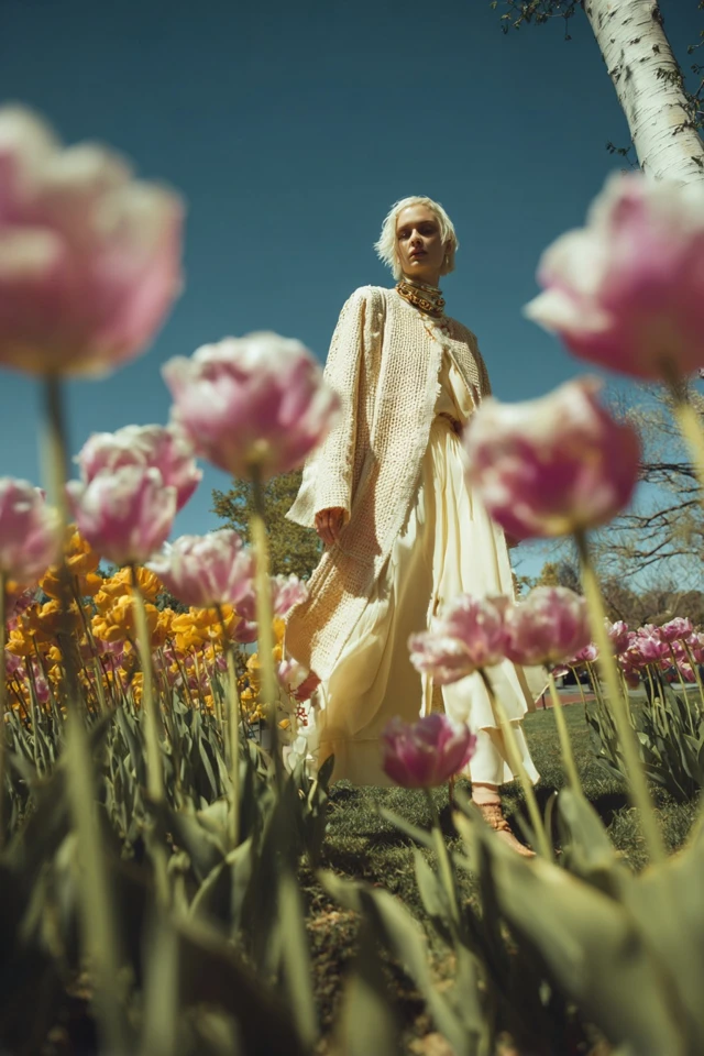
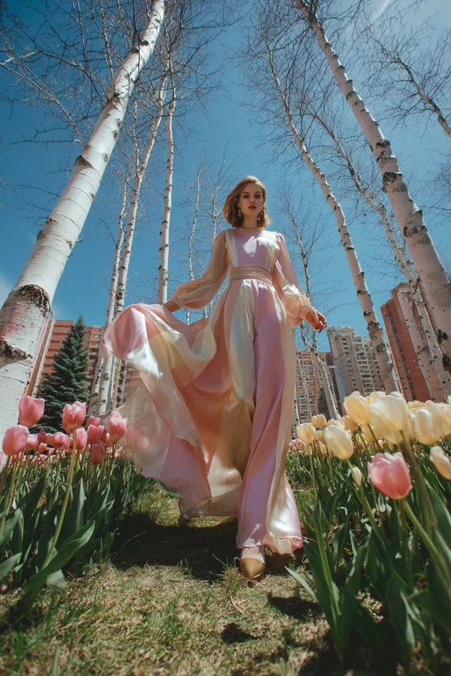
A muted color palette is a set of colors softened with gray, beige or brown, so they look calm and dusty instead of bright and punchy. Think sage instead of kelly green, dusty rose instead of hot pink. For spring, it is the quiet, feminine way to wear color.
Below: what the term means, shades to try, who tends to suit them, and outfit formulas you can copy.
What is a muted color palette?
Muted colors have lower saturation. Saturation is how intense a color looks, and muting a color lowers it by mixing in a neutral. The result reads gentler and a bit more grown-up. Color guides often describe a range of tones, as the University at Buffalo's page on using color to express tone puts it: colors range from formal to casual and from muted to vibrant.
The opposite of a muted color palette is a vivid or saturated one: electric coral, fuchsia, cobalt, lemon yellow. Pastels are close cousins but not identical. A pastel is light and soft; a muted color can be light, mid or deep, as long as it looks grayed down.
Muted colors examples for spring
These shades work well together because they share the same softness:
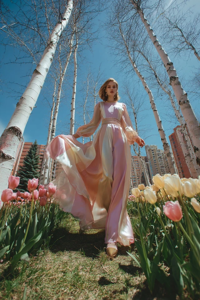
- Dusty rose and blush-beige
- Sage and eucalyptus green
- Soft lilac with a gray cast
- Muted apricot or terracotta-peach
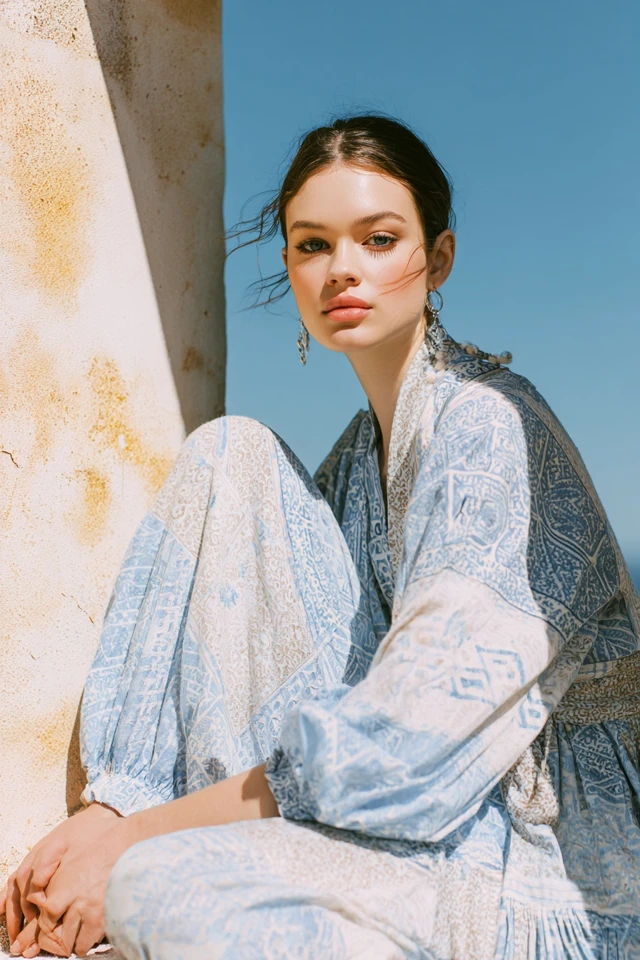
- Powder blue with a touch of gray
- Oatmeal, ivory and taupe as the base
I haven't listed hex codes because the same name shifts between brands and screens. If you need exact values for a mood board, sample them from a photo of the fabric you actually plan to buy.
Who looks good in muted colors?
Almost anyone can wear them, but the effect changes with contrast. If your hair, skin and eyes are fairly close in depth and softness, muted shades tend to blend with you instead of competing. If you have high contrast, such as very dark hair with fair skin, a muted color can look a little flat unless you add a darker piece beside it.
Undertone matters too. Warm undertones usually flatter muted peach, apricot and olive-leaning greens. Cool undertones often look better in dusty lilac, rose and blue-gray. Neutral undertones can mix both. Check in daylight, holding the fabric near your face: if your skin looks tired or sallow, try the same color one step lighter or warmer.
What season is muted colors?
In seasonal color analysis, muted palettes are usually associated with the soft seasons (often called soft summer and soft autumn). The names and rules vary between systems, so treat it as a starting point, not a verdict. Through the lens of evidence-based design, I'd say the useful part is the idea underneath: low-contrast, low-intensity colors feel harmonious next to each other.
How to wear muted colors in outfits
Muted colors outfit ideas are easiest with a simple formula: one base neutral, one muted color, one small accent.
- Sage knit top, cream trousers, tan loafers.
- Dusty rose midi skirt, oatmeal cardigan, white sneakers.
- Soft lilac shirt, light denim, silver or pale gold jewelry.
- Apricot blouse with ivory wide-leg pants and a taupe bag.
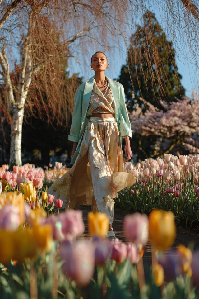
For a head-to-toe look, stay within two or three muted tones and vary the texture. Linen, brushed cotton and soft knits all catch light differently, which keeps a tone-on-tone outfit from looking flat.
Tips for styling muted palettes
Add contrast on purpose
Muted colors can blur together. A darker belt, a deeper bag or a crisp white tee gives the eye a place to land.
Mind the fabric
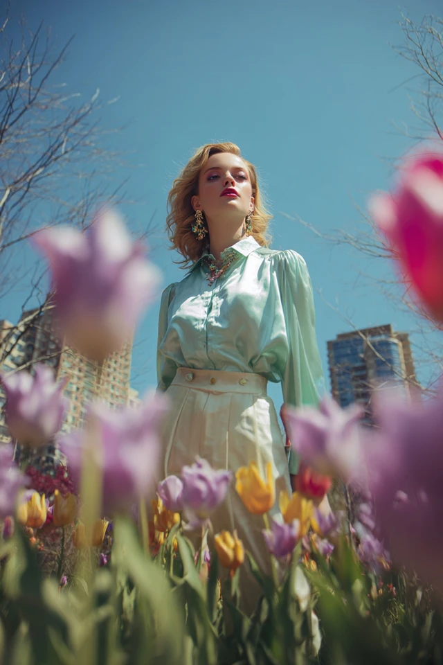
A matte fabric makes a muted color look softer. A shiny satin in the same shade looks brighter, because the surface changes how light reaches your eye. As an architect trained in evidence-based design, I'd choose matte weaves when you want the dusty effect.
Test in natural light
Muted shades shift under store lighting. Try them near a window before you commit.
Mix with a brighter piece sparingly
One saturated item, like a coral scarf, can lift a muted outfit. Keep it to a single piece so the palette still reads as calm.
For more spring combinations, see the spring elegant color palette, the retro spring styling tips and the livelier bold spring ideas if you want to compare muted with vivid. The spring floral dress palette shows how to bring pattern into soft colors.
Frequently asked questions
What is a muted color palette?
It is a group of colors with reduced saturation, softened by gray, beige or brown. They look calm and slightly dusty rather than bright.
Who looks good in muted colors?
People with softer, lower-contrast coloring often find them blend most easily, but anyone can wear them. Add a darker or crisper piece if a muted shade looks flat on you.
What season is muted colors?
Color analysis systems usually link muted palettes to the soft seasons, such as soft summer or soft autumn. Systems differ, so use it as a guide.
What is the opposite of a muted color palette?
A vivid or saturated palette, with intense colors such as fuchsia, cobalt or bright coral.
Filed under Outfit Ideas