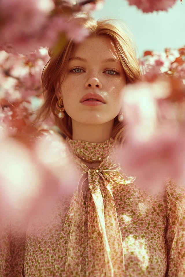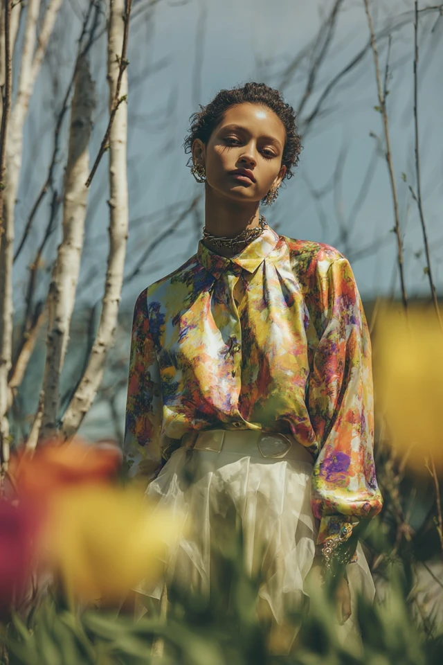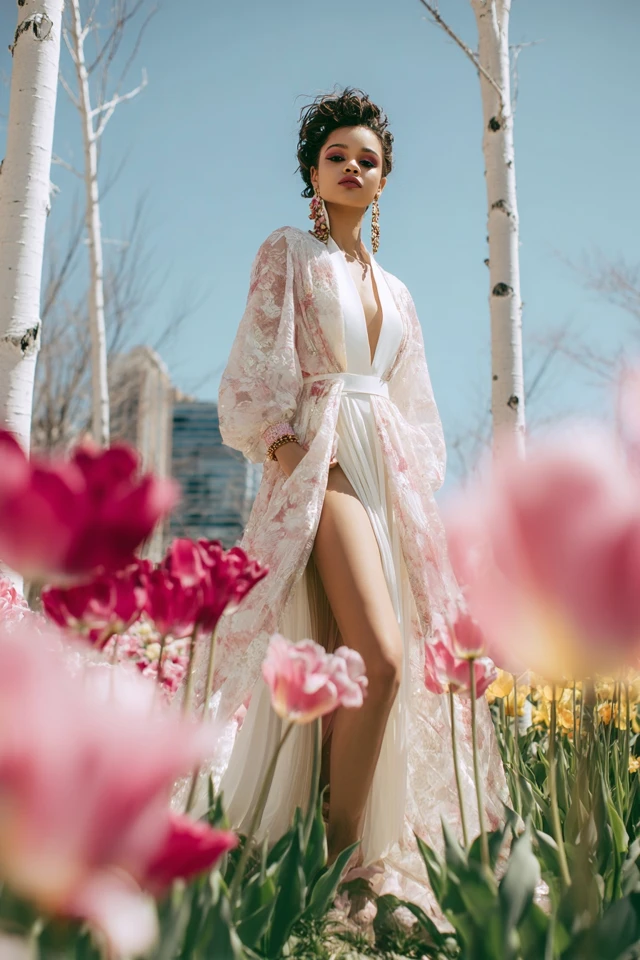
Bold Spring Ideas Color Palette
- Words by
- Julio Arco
- Published
- Reading
- 5 min
A spring color palette is built from warm, clear, fresh colors: coral, peach, warm yellow, leaf green, aqua and a golden or creamy neutral. If your natural coloring is warm and light to medium, and you look best in colors that feel sunny rather than dusty or icy, you are probably a spring.
Seasonal color analysis sorts people into groups by undertone, depth and how much contrast they have. Spring is the warm, bright group. Below you will find how to check yourself, how the three subtypes differ, and what to wear.
How to tell if you are a spring
Start with undertone, the color beneath the surface of your skin. Springs usually lean warm: skin can look peachy, golden or ivory, and veins on the wrist often read greenish. Hair tends toward golden blonde, strawberry, light brown or warm brown. Eyes are often clear blue, green, hazel or warm light brown.
Then run a simple test in daylight, near a window, with a clean face:
- Hold a warm coral or peach top under your chin, then a cool fuchsia or icy gray one.
- Notice whether the warm color makes your skin look even and lit, or whether it looks like it is wearing you.
- Check the cool color the same way. If it turns your skin sallow or gray, that points toward spring.
Lighting and nearby colors change how a shade reads, so treat this as a strong hint and not a verdict. If you land between two seasons, that is common, and the subtypes below are there for exactly that reason. Skin or hair concerns are a question for a professional, not a color chart.
The three spring subtypes
Springs are not all alike. Which quality dominates in your coloring decides your subtype.
Light spring
A light spring color palette is soft, warm and airy: peach, butter yellow, pale aqua, light moss, warm pink. If your coloring is delicate and low in contrast, deep or heavy colors can overpower you. Pastels with a warm base work better than chalky ones.
Warm spring
The warm spring color palette (often called true spring) leans golden: marigold, coral, tomato red, grass green, turquoise, camel. These colors have a visible yellow base. If gold jewelry and golden browns make you glow, start here.
Bright spring
A bright spring color palette is clear and high in contrast: hot coral, vivid turquoise, bright emerald, warm pink, saturated yellow. If you have, say, dark hair with light eyes and clear skin, muted colors can look flat on you while crisp ones wake everything up.
What colors look best on spring skin tones?
The best colors for spring skin tones share three traits: warmth, clarity and a medium to high level of brightness. Think of colors you would see in sunlight on a garden, not in fog.
- Reds and pinks: coral, salmon, watermelon, warm rose
- Yellows and oranges: buttercup, marigold, apricot, tangerine
- Greens: leaf, lime, spring green, light olive
- Blues: turquoise, aqua, periwinkle, warm medium blue
- Purples: soft orchid and warm lavender, used sparingly
Through the lens of evidence-based design, I'd look at saturation as much as hue. A color that is too muted or too dark for your coloring tends to read as heavy near your face, even when the hue itself is technically right.
Best neutrals for a spring
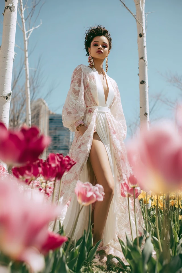
A neutral spring color palette stays warm and light: cream, ivory, camel, tan, warm beige, golden brown, light warm gray and a soft navy. These give you a base for outfits without dulling your coloring.
Pair a neutral with one clear accent. Camel trousers with a turquoise knit, or an ivory blazer over a coral top, are easy formulas that need no extra styling.
Can a spring wear black?
Yes, with a few adjustments. Black is the harshest neutral for most springs because it creates a hard line near the face. Wear it lower on the body, in trousers, a skirt or shoes, and keep a warm color at the neckline. Dark chocolate brown or warm navy is a gentler swap near the face.
Gold or silver: which metal suits a spring?
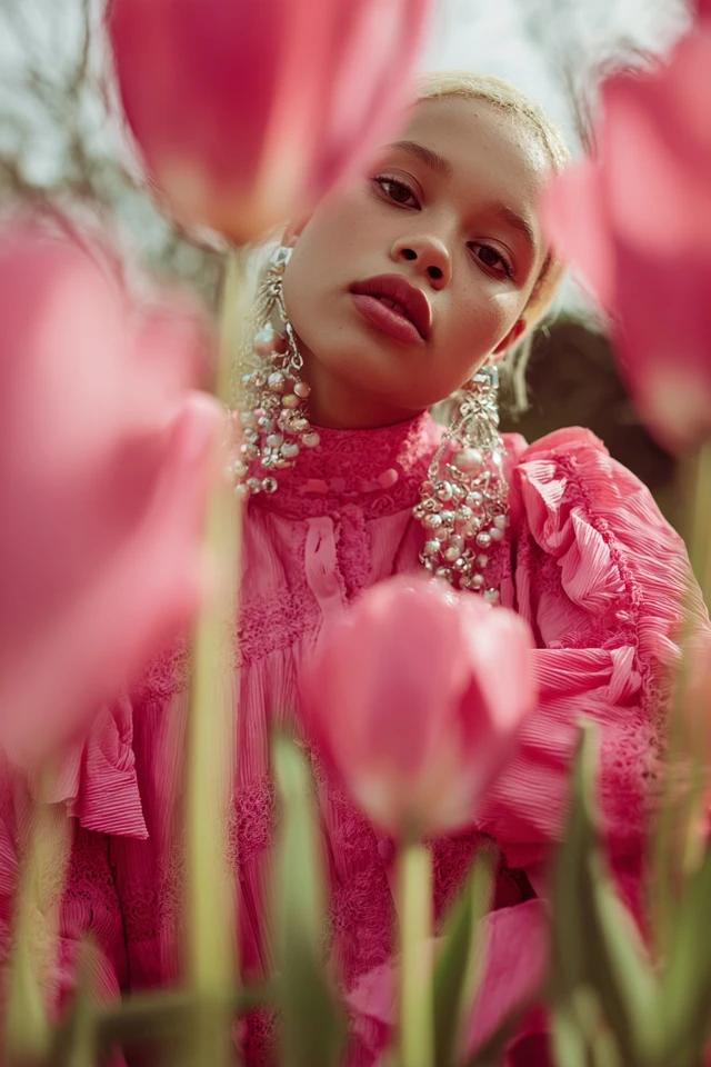
Most springs look best in yellow gold and rose gold, since both echo the warm undertone. Silver can work for a bright spring with high contrast, especially in a polished, shiny finish. Matte or antiqued silver tends to look gray against warm skin. When in doubt, hold both near your face in daylight and see which one makes your skin look clearer.
Color combinations and prints that work
Springs can handle more color at once than most seasons, as long as the colors share the same warm, clear quality.
- Coral with turquoise: high energy, good for a bright spring.
- Butter yellow with warm pink: soft and sunny, suited to a light spring.
- Camel with leaf green: grounded and warm, a good daily pairing.
- Cream with marigold: easy and bright without being loud.
For prints, pick ones where the background is cream or a light warm tone and the colors inside come from your palette. Floral and small geometric patterns suit this well. If you want more floral ideas, see this spring floral dress color palette.
Fabric and texture matter too
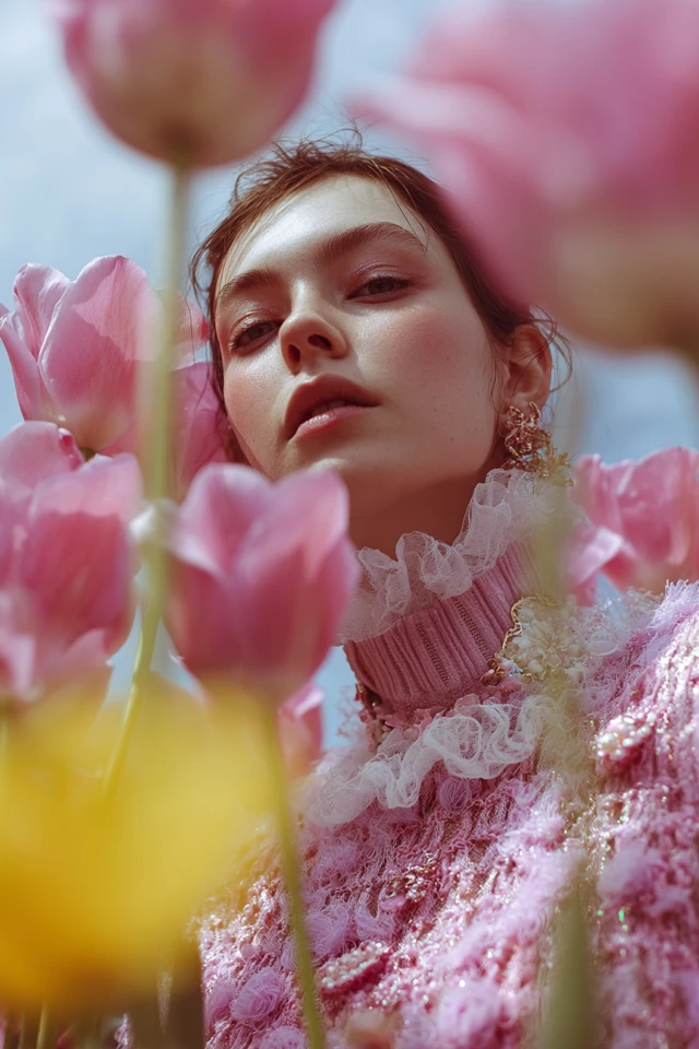
Surface changes how a color reads. Satin and silk bounce light and make a shade look more saturated. Matte cotton, linen and fine knits soften it. As an architect trained in evidence-based design, I'd choose a matte weave for a very bright color you worry is too loud, and a smooth, lightly glossy fabric when a soft pastel needs more presence.
How to start wearing your palette
If bold colors feel like a leap, begin near the face with a scarf, earrings or a top, and keep trousers and shoes neutral. Once that feels comfortable, try a full color block.
- Choose three or four colors from your subtype and build outfits around them.
- Add one warm neutral that works with all of them.
- Check colors in daylight before buying, since store lighting can change them.
For more ideas, browse this bold spring edit, this elegant spring palette and these spring styling tips. Wash bright pieces in cold water with similar colors to keep them clear, and store them out of direct sun.
Sister palettes and other seasons
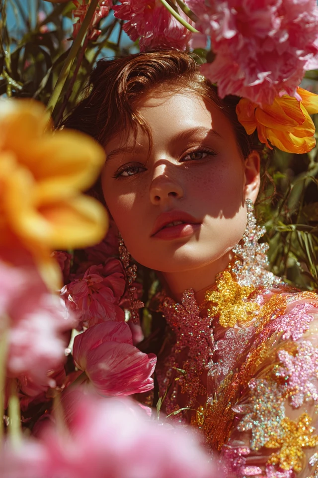
If spring does not feel quite right, the neighboring groups are worth testing. Autumn shares the warmth but is deeper and more muted. Summer shares the lightness but is cool and soft. Many people sit between two of these, and the subtype labels (light, warm, bright) usually make clear which direction you lean.
Frequently asked questions
How do I tell if I am a spring color palette?
Look for warm undertones, light to medium coloring and clear eyes or hair. In daylight, warm coral or peach near your face should look better than icy or gray shades.
Should springs wear gold or silver?
Most springs suit yellow or rose gold best. A high-contrast bright spring can often wear shiny silver as well.
What colors look best on spring skin tones?
Warm, clear colors such as coral, peach, marigold, leaf green and turquoise. Avoid very muted or very dark shades near the face.
Can a spring wear black?
Yes, but keep it away from the face by wearing it in trousers, skirts or shoes. Dark brown or warm navy is softer near the neckline.
Filed under Outfit Ideas