Spring Color Palette: How to Tell If You're a Spring
- Words by
- Julio Arco
- Published
- Reading
- 4 min
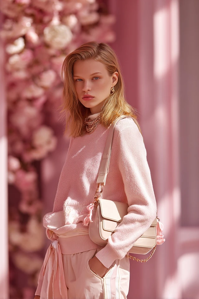
A spring color palette is built from warm, clear, fresh colors: peach, coral, warm yellow, leaf green, aqua and creamy neutrals instead of stark white or black. If your skin has a golden or peachy cast and your natural coloring looks lively rather than muted, spring is the season to test first.
Seasonal color analysis is a styling system, not a law. Treat it as a starting point, hold colors up to your face in daylight, and keep what makes your skin look rested.
How to tell if you're a spring
Start with undertone, then look at how bright or soft your coloring is overall. Springs usually have warm undertones and coloring that looks clear and light-reflecting.
- Gold jewelry looks more natural on you than silver.
- Skin tends toward ivory, peach or warm beige, and may freckle.
- Hair is often golden blonde, strawberry, light brown or warm brown.
- Eyes are often light or clear: blue, green, hazel or warm light brown.
- Camel, coral and warm green flatter you more than gray, burgundy or icy pink.
For a quick test, sit by a window in daylight with a bare face. Drape a peach top, then a cool pink one under your chin. If the peach makes your skin glow and the pink makes it look sallow or flat, that points to warm. Wrist veins are a popular shortcut, but they are unreliable, so trust the drape test more.
Not sure which spring you are? Read the three subtypes below and see which description fits your coloring best.
What are the spring subtypes?
Light spring color palette
Light springs have delicate coloring, so strong colors can overpower the face. The palette is soft and sunny: buttercream, pale peach, light aqua, soft apricot, mint and warm ivory. Keep contrast low to medium, for example cream with light coral.
Warm spring color palette
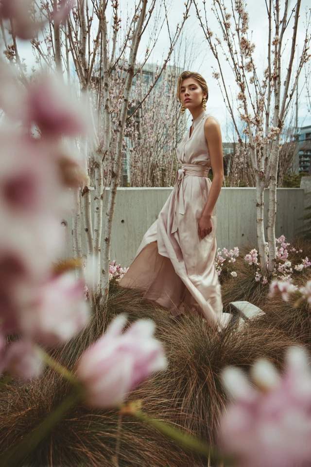
Also called true spring, this is the most golden version. Think marigold, coral, warm turquoise, grass green, camel and warm brown. These colors read as sunny rather than pastel, and they sit well next to golden skin and hair.
Bright spring color palette
Bright springs have high contrast between skin, hair and eyes, and they carry saturated colors well. Hot coral, clear turquoise, vivid kelly green, warm fuchsia and sunny yellow work. Pair a bright color with a clean neutral so the outfit does not feel busy.
What colors look best on spring skin tones?
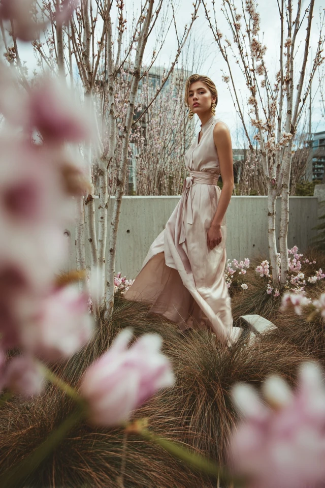
The best colors for spring skin tones are warm and clear: peach, salmon, coral, apricot, warm pink, buttery yellow, leaf green, mint, aqua and periwinkle with a hint of warmth. Through the lens of evidence-based design, I'd look at saturation as much as hue. A muddy, grayed version of coral reads dull next to a spring complexion, while a clear one brings out its brightness.
Fair springs can lean toward the lighter end, and deeper or olive-toned springs can use richer versions of the same hues, such as warm teal or deep coral. Check each color near your face in daylight before committing.
Which neutrals suit a spring?
A neutral spring color palette swaps stark black and white for warmer, softer options:
- Ivory and cream instead of optic white
- Camel, tan and warm beige
- Warm chocolate or golden brown instead of black
- Soft navy or warm gray-blue for tailoring
Camel trousers with an ivory knit is an easy base. Add coral or aqua near the face and you have a complete outfit. For a polished layer, see this blazer color palette.

Can a spring wear black?
Yes, with care. Black is the highest-contrast neutral, and on a light spring it can overpower the face. If you love it, keep black away from your neckline, wear it as trousers or shoes, and put a warm color near your face. Dark chocolate or soft navy is usually kinder.
Should springs wear gold or silver?
Gold, usually. Yellow gold, light gold and rose gold suit warm coloring. Bright springs can sometimes wear silver if the finish is shiny and clear, but brushed or antique silver tends to look cool against a warm complexion. Pearls in cream rather than stark white are a good alternative.
Color combinations that work
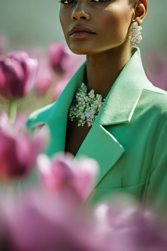
- Mint and ivory for daytime
- Coral and camel for a warm, grounded look
- Aqua with warm yellow for a bright, playful pairing
- Peach with light olive for a soft, natural feel
For prints, choose florals with clear, warm colors on a cream ground rather than a black one. If you want ideas, browse this spring floral dress palette and these bolder spring ideas. For a throwback mood, try the retro spring styling tips.

Sister palettes and other seasons
Springs sit next to autumn (also warm, but deeper and softer) and summer (soft, but cool). If spring colors feel too bright and autumn ones suit you better, you may be a warm-leaning blend. If you lean cool and muted, check summer. Winter is the cool, high-contrast neighbor; for comparison, see the winter statement palette.
As an architect trained in evidence-based design, I'd treat any palette as a guide to how color reads next to your face, not a rulebook. If a color outside your season makes you feel good, wear it lower on the body and keep your best colors near your face.
Frequently asked questions
How do I tell if I am a spring color palette?
Look for warm undertones, clear and light-reflecting coloring, and a preference for gold over silver. Drape peach and cool pink fabric near your face in daylight and see which looks healthier.
Should Springs wear gold or silver?
Gold usually suits springs best, including yellow, light and rose gold. Shiny silver can work for bright springs, but antique or brushed silver often looks cool.
What colors look best on spring skin tones?
Warm, clear colors such as peach, coral, apricot, warm pink, mint, aqua and leaf green. Avoid grayed or very dark shades near the face.
Can a spring wear black?
Yes, but keep it away from the face, since it can feel heavy. Trousers, shoes or a bag in black work, with a warm color on top.
Filed under Outfit Ideas