Beach Color Combinations That Look Great Outdoors
- Words by
- Julio Arco
- Published
- Reading
- 4 min
The easiest beach color combinations pair a sandy neutral with one water color: cream with ocean blue, tan with sage, or white with navy. Keep to two or three colors per outfit and let one of them lead.
Below are the palettes that work most reliably outdoors, what to wear in each, and a few practical notes on choosing between them.
What colors look best on the beach?
Colors that echo the setting. Sand, sea, sky and dune grass already sit together, so clothes borrowed from that range look settled against the background. Soft, slightly muted shades photograph and read well in bright light, while very saturated ones can look harsh when the sun is high.
Through the lens of evidence-based design, I'd think about surface before hue. A matte linen and a shiny satin in the same blue do not read as the same color, because the fabric changes how light reaches the eye. At the beach, matte and textured weaves usually look calmer.
Sandy neutrals and warm whites
This is the neutral coastal color palette most people can wear without thinking: warm white, cream, oatmeal, sand, camel and a touch of driftwood gray. It blends into the shoreline and keeps attention on your face and accessories.
- Cream linen shirt with sand-colored shorts or wide trousers.
- Oatmeal knit cover-up over a warm white swimsuit.
- A camel straw hat and leather sandals to add depth without adding a new color.
The risk is looking flat. Mix textures (linen, cotton gauze, raffia) so the neutrals have some variety. If you like this earthy side, the earthy spring pieces use many of the same shades.
Ocean blues and nautical palettes
Blue is the classic answer for beach color combinations clothes lovers return to. Pair a mid ocean blue with white or cream for a fresh, relaxed look, or go deeper with navy and white for a more tailored, nautical feel.
Light blue with sand is the softest version. Navy with white stripes and a tan accessory is the sharpest. Add a small hit of coral or yellow if navy feels too formal for the shore.

Soft yellows and sun-kissed accents
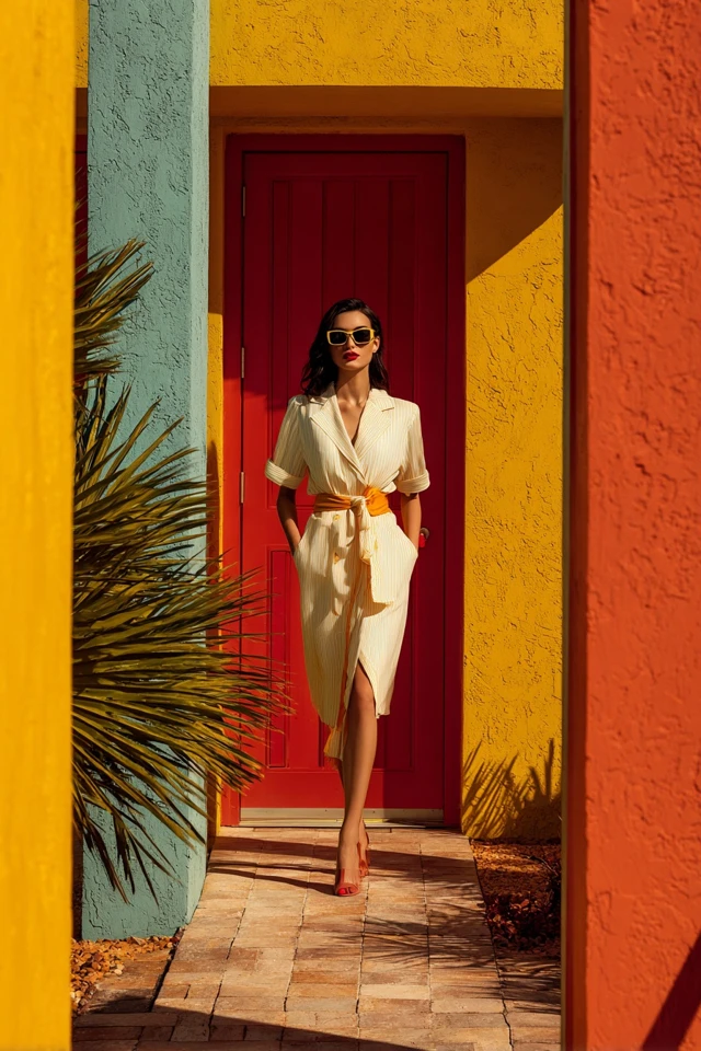
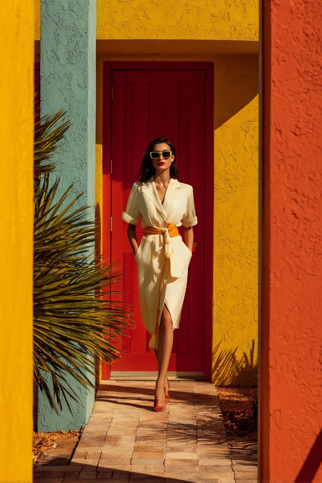
Butter yellow and pale lemon warm up neutrals and sit well next to blue. Use yellow as the lead in a beach dress, then keep everything else quiet: white sandals, a straw bag, simple gold jewelry.
If yellow is too close to your skin tone for comfort, hold a swatch or garment under your chin in daylight. If your face looks tired, move it lower down, as a skirt or a scarf on your bag.
Blues and greens for a seaside feel
Sea glass, sage, teal and seafoam give a cooler, calmer palette. Sage with cream is gentle and works for a beach color combinations dress that has to go from sand to dinner. Teal with sand is a bit bolder and still easy.
Keep the greens slightly gray. Very bright greens compete with the water, while muted ones sit alongside it.
Bright and playful beach pairings
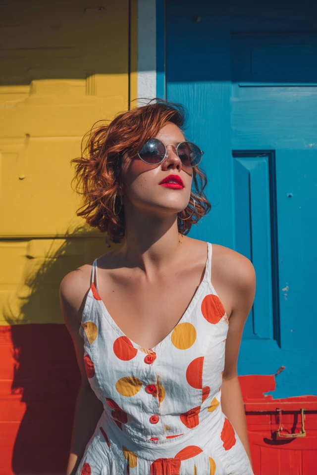
A bright beach color palette suits vacations, casual days and anyone who likes to be seen. Reliable pairings are coral with turquoise, hot pink with white, and orange with sky blue.
- Choose one bright piece and keep the rest neutral.
- If you wear two brights, make one of them a small item such as a bag or sandals.
- White is the easiest buffer between two strong colors.
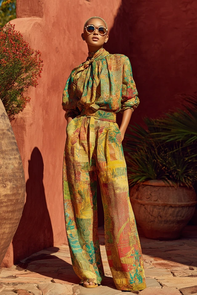
For a more graphic take on color, see the bold print ideas, and for a pink-leaning option the comfy barbiecore edit.
How to choose and use a palette
- Pick a lead color you feel good in, then add one neutral and one accent at most.
- Check it outdoors. Beach light is stronger than shop light and can wash out pale colors.
- Repeat a color once, for example blue in a dress and in a small accessory, so the outfit looks planned.
- Think about what you will stand in front of. Light neutrals vanish on pale sand but stand out against water, while navy does the reverse.
If you are dressing a group, choose a shared range (say, blues and creams) and let each person pick their own shade within it.
Color is not the only thing to pack for sun
Color gets the attention, but fabric and coverage matter for the sun. The Skin Cancer Foundation notes that a UPF of 30 to 49 offers very good protection, while UPF 50+ offers excellent protection. A light kimono or shirt in a sandy or blue shade can do double duty if it is rated.
On hats, dermatologist Anna L. Chien, MD, of Johns Hopkins University School of Medicine, says in the same piece: "A hat with a 3-inch brim protects the top of your scalp, ears and face." A wide-brim straw hat in camel or cream fits nearly every palette above.
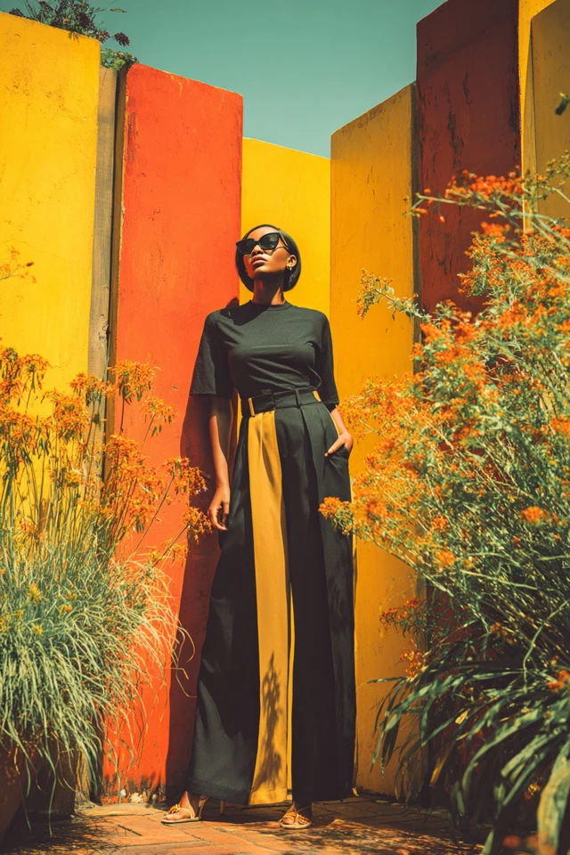
For more resort styling, the sophisticated resort picks carry these palettes into dinner outfits.
Frequently asked questions
Which color goes with beach color?
Sand, cream and white go with almost every beach shade. Ocean blue, sage and soft yellow also pair easily with them.
What are some popular beachy colors?
Sandy beige, warm white, ocean blue, navy, seafoam, sage and soft yellow are the most common. Coral and turquoise are popular when you want something brighter.
What colors look best on the beach?
Muted, sea-and-sand shades look calm and photograph well in strong light. A single bright accent against neutrals also works well.
What beach color palette works for family photos?
Choose a shared range, such as blues with cream and white, and let everyone pick a shade in it. Avoid heavy logos and clashing brights so the group looks cohesive.
Filed under Outfit Ideas