Tomato Girl Pastel Hues Wardrobe Essentials
- Words by
- Julio Arco
- Published
- Reading
- 5 min
The easiest pastel color combinations pair one pastel with a neutral (white, cream, light denim) or two pastels that share the same softness. Pink with mint, blue with lavender, and peach with butter yellow all work because their lightness is similar, so neither color shouts over the other.
Below: what makes pastels tick, the pairings worth trying, how to build them into outfits and dresses, and a few fabric and fit notes that keep them looking fresh. They suit the soft, fresh-produce mood of the tomato girl look too, especially when you add warm neutrals.
What makes a color pastel?
A pastel is a color with white added. The University of Georgia's CAES Field Report explains that when white is added to a color it becomes lighter and is called a tint. That is all pastels are: tints of pink, blue, green, yellow and violet.
It matters for outfits because pastels sit at a similar level of lightness. Professor Bodie V. Pennisi describes it this way in the same publication: "Value is the lightness or darkness of each color. Adding white, black or white and black (which combine to make grey) to each color changes its value". When two colors share a similar value, they sit together calmly. That is the whole trick behind most pastel pairings.
What pastel colors go well together?
Start with pairs. Two pastels are easier to balance than three, and you can add a neutral to quiet things down.
Pastel pink and mint green
Pink and green sit opposite each other on the color wheel, so each makes the other look a little clearer. Keep both at the same softness. A mint top with blush trousers, or a pink knit over a mint skirt, reads fresh without looking like a candy shop. Cream or white in between helps.
Pastel blue and lavender
These neighbors blend easily. The CAES publication notes that green and blue are cool colors that evoke relaxed and calm feelings, and lavender leans the same way. Try a baby blue shirt under a lavender cardigan, or a lavender skirt with a pale denim jacket.
Peach and butter yellow
A warm pairing. Peach near your face is forgiving, and butter yellow adds light. Use white or tan as the third color so the look does not turn sugary.
Blush pink and light gray
Gray is the quiet partner here. A pale pink cami under a light gray cardigan looks soft but grown-up.
Mint and cream
The simplest of all. Mint on its own can feel cool against skin, while cream warms it up.
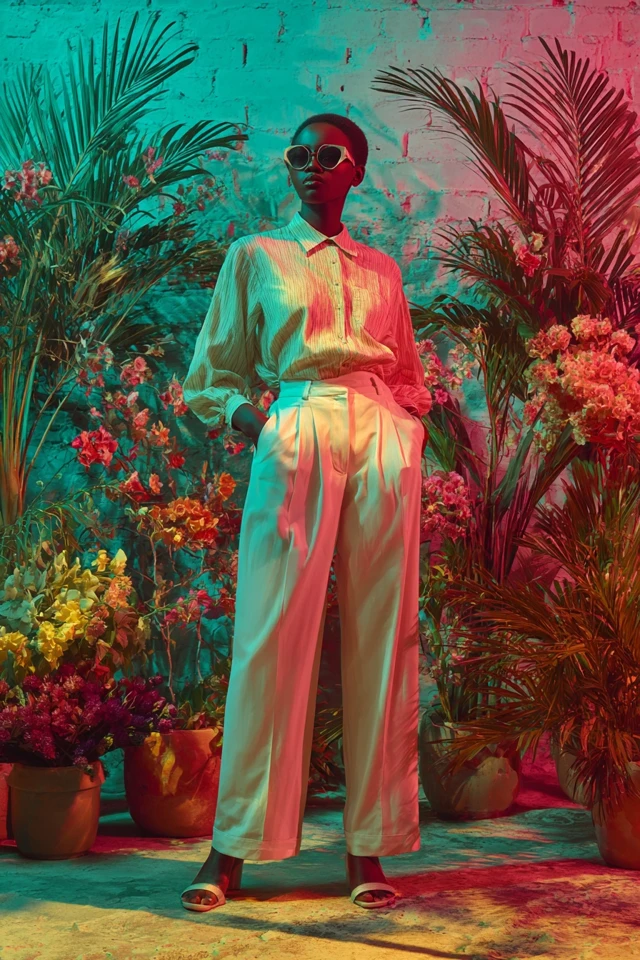
Pastel color combinations for outfits
A reliable formula: one pastel as the main piece, a second pastel in a smaller dose, and a neutral to hold them together. Here are combinations to try:
- Mint top, white jeans, blush flats.
- Lavender midi skirt, cream blouse, nude sandals.
- Soft coral sweater over a chambray shirt, light beige trousers.
- Baby blue blazer over a pastel yellow dress.
Light-wash denim, a crisp white shirt and a neutral trench or cardigan do most of the work. They give pastels a base so the colors look chosen rather than accidental.
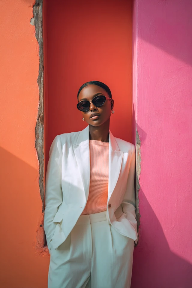
Pastel color combinations for dresses
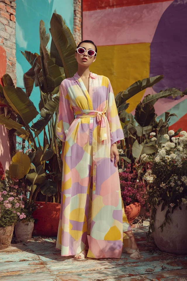
A pastel dress already is the whole palette, so the question is what goes around it. Keep shoes and bags in a neutral or a muted metallic. Add a cardigan in white, beige or soft gray rather than a second strong pastel.
If you want two pastels in one look, let the dress be the larger area and the jacket or scarf the smaller one. A mint dress with a blush scarf works well; half mint, half pink on equal terms is harder to carry. Minimalist cuts also stay wearable longer than trend-heavy ones.
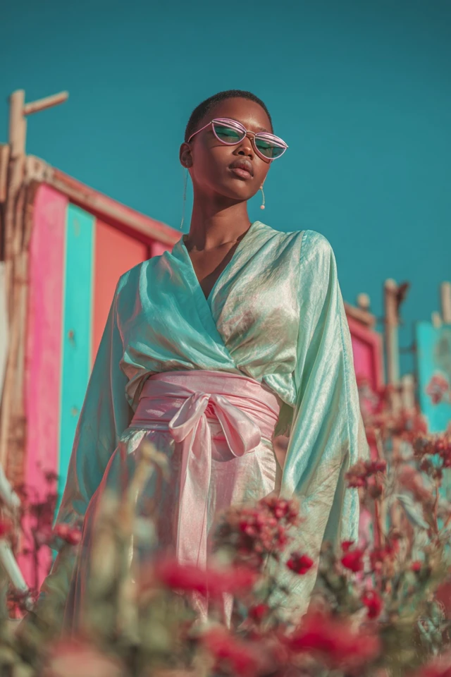
Does fabric change how pastels look?
Yes. Through the lens of evidence-based design, I'd think about texture before color. A matte linen and a glossy satin in the same pale pink do not read as the same pink, because the surface changes how light reaches your eye. Matte fabrics look softer and calmer. Shiny ones look brighter and more formal.
Linen, cotton blends, lightweight knits, chiffon and silk all drape well in light colors. Sheer fabrics such as chiffon or lace add depth, since light passes through and the color looks a touch deeper at the seams and layers.
How do you choose pastels for your skin tone?
There are no strict rules, and a pastel you love near your face usually beats one a chart assigns you. As a starting point, peach, coral and apricot tints tend to feel warm against warmer skin, while lavender, baby blue and mint can feel cooler and crisper against cooler skin. If you are not sure, hold the fabric up in daylight and see whether your face looks rested or tired next to it.
Not loving a color near your face is a placement problem, not a verdict. Wear it as a skirt, trousers or shoes instead, and put a color you like closer to your face.
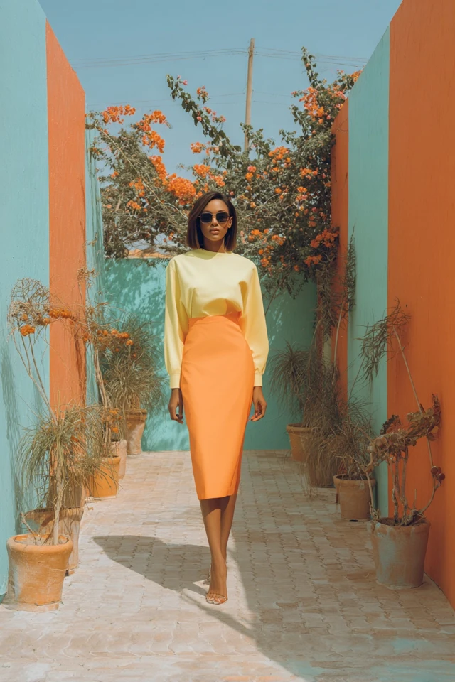
Keeping pastel clothes looking good
- Wash inside out with a gentle detergent.
- Store them away from direct sunlight, which fades light colors.
- Steam instead of washing again when you only need to remove wrinkles.
For more ideas, see soft girl pastel outfit ideas, the pastel capsule wardrobe, and more polished pastel outfits. If you like the warmer tomato girl direction, the elegant tomato girl capsule wardrobe is a good next stop.
Frequently asked questions
What are two pastel colors that would look good together?
Pastel pink and mint green, and pastel blue and lavender, are the easiest pairs. Both combinations share a similar lightness, so neither color overpowers the other.
Which pastel color is best?
It depends on where you wear it. Choose the pastel you like near your face, and use the others in skirts, trousers or accessories.
What are the trending pastel colors for 2026?
Trend forecasts change often, so treat any list with caution. Soft lavender, pale blue, blush and mint are long-running favorites that pair easily with neutrals.
Can you wear three pastels at once?
Yes, if one covers most of the outfit and the others appear in small doses, such as a scarf or shoes. Adding a neutral like white or cream keeps it calm.
Filed under Outfit Ideas