Minimalist Graphic Tees: A Monochrome Palette Guide
- Words by
- Julio Arco
- Published
- Reading
- 4 min
The easiest way to wear minimalist graphic tees is to stay inside one color family: black, white and gray, or a single earthy hue like olive or taupe, with one small, quiet print. The tee does the talking, and the palette keeps everything else calm.
Below: what makes a graphic tee minimalist, how to pick tones, which fabrics and fits hold up, and how to style the result for different wardrobes.
What makes a graphic tee minimalist?
Three things: few colors, plenty of empty space around the print, and a design you can read in one glance. Simple graphic tees with clean designs usually have a small line drawing, a single word, a thin geometric shape or a tone-on-tone logo.
Monochrome takes this a step further. When the print is a darker or lighter shade of the shirt itself, it reads as texture first and graphic second. From a distance it looks plain; up close it has detail.
How to build a monochrome palette
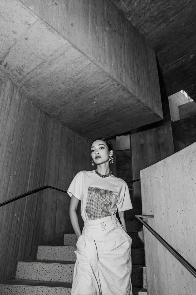
Pick one hue and vary its depth. A charcoal tee with a slightly lighter gray print, worn with black trousers, looks deliberate because the tones sit next to each other on the same scale.
- White and cream: a clean, light look. Keep the print in a slightly deeper cream so it doesn't fade out.
- Charcoal, slate and black: the most forgiving combination, and easy to layer.
- Olive and muted green: softer than gray, and good with denim.
- Dusty rose and blush: a gentle option that still looks tidy when the print is small.
Through the lens of evidence-based design, I'd look at texture before color. A matte cotton and a glossy print in the same gray do not read as the same gray, because the surface changes how light reaches your eye. That is why tone-on-tone prints with a slightly different finish look so interesting.
Which fabric and fit work for everyday wear?
Choose a midweight cotton or cotton blend that drapes without clinging. Thin jersey tends to show every seam and wrinkle, while a heavier knit holds a clean shape and carries a print more crisply.
Check the shoulder seam first. It should sit where your shoulder ends. A tee that pulls across the chest or hangs off the shoulder is a fit problem, not a you problem. Then look at the hem: it should land around the hip bone for a regular fit, or a bit longer for a relaxed one.
On print quality, screen printing generally lasts longer and looks crisper than iron-on transfers. Washing in cold water and air drying helps any print last.
Minimalist graphic tees for guys
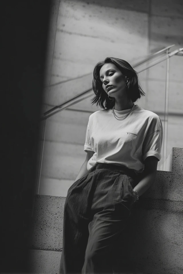
Minimalist graphic tees for guys work best in a straight or slightly boxy cut with a small chest print or a modest back print. Keep the sleeve ending mid-bicep and the body skimming, not tight.
- Charcoal tee, dark jeans, white sneakers for a default weekday outfit.
- Black tee under an unstructured overshirt in a similar tone for cooler days.
- Cream tee with olive chinos when you want something lighter.
Minimalist graphic tees for women
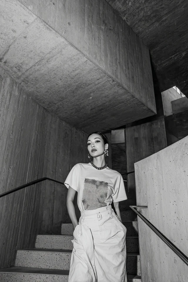
Minimalist graphic tees women's styles are easy to dress up or down. A slightly cropped or tucked tee with high-waisted trousers keeps proportions clean, and a longer tee over leggings or tailored shorts looks relaxed.
For a more polished version, layer a tonal blazer or cardigan over the tee and add one metal accessory. If you want ideas on keeping the palette gentle, see neutral graphic tee mood, and for a dressier take, the elegant graphic tee guide.
How do streetwear and vintage styles fit in?
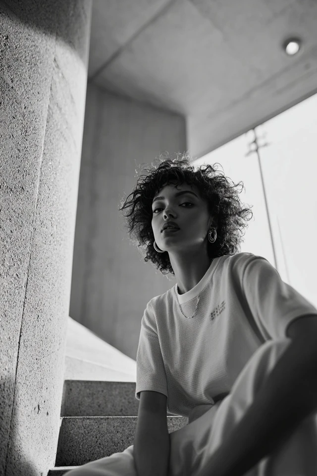
Vintage graphic tees streetwear looks usually go oversized, with faded or washed color and a worn-in print. You can keep that spirit while staying minimal: choose a faded black or washed gray with a small, aged-looking graphic and wear it with straight-leg pants.
The thing to watch is scale. One big print and loose proportions already make a statement, so keep everything else plain. More on this direction in vintage graphic tee essentials.
Choosing the right tone for your complexion
There is no strict rule, but a general guide helps. Warmer skin tones often look good next to camel, olive and deep red-browns, while cooler tones often suit ash gray, navy and icy blue. Hold the tee up near your face in daylight: if your skin looks tired next to it, try a shade deeper or lighter.
Where to wear them
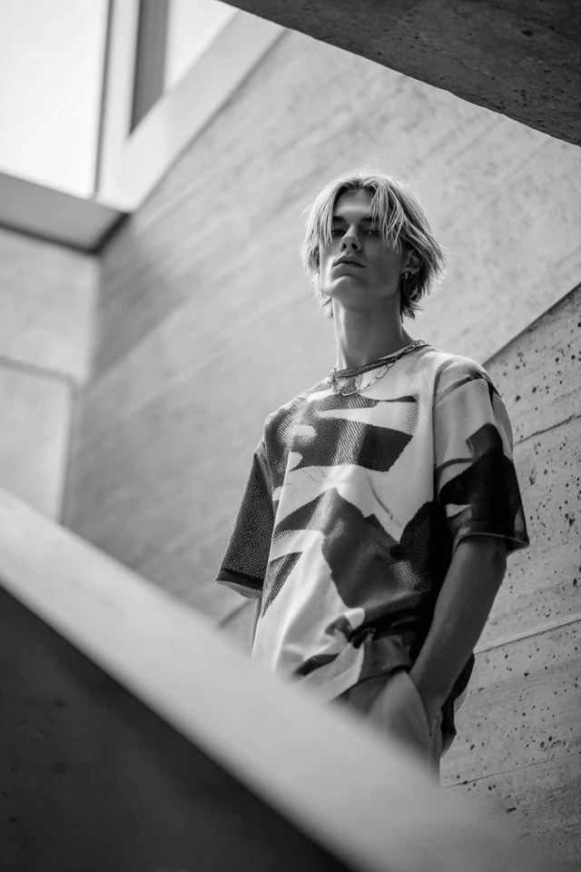
A tonal tee with tailored trousers and a structured jacket works in a relaxed office. For weekends, denim and a light layer is enough. If you want more outfit combinations, the minimalist graphic tee palette and casual graphic tee chic cover related looks. Minimalist graphic t-shirts also layer well for summer; see summer graphic tee outfit ideas for lighter pairings.
Frequently asked questions
How do I find my signature monochrome color?
Look at which colors you already reach for and which make you feel comfortable. Try a few shades of that family near your face in daylight and keep the ones that look best.
Can a minimalist graphic tee work for formal settings?
In relaxed dress codes, yes. Pair a plain-print tee with a structured blazer and tailored trousers or a skirt, and keep the colors tonal.
Which colors should I avoid mixing in a monochrome look?
Avoid pairing very bright shades with muted ones in the same outfit, because the contrast breaks the tonal effect. Stay within one hue family and vary only the depth.
Filed under Outfit Ideas