Beach Color Combinations That Look Good in Any Light
- Words by
- Julio Arco
- Published
- Reading
- 4 min
The easiest beach color combinations borrow from the setting: sand and warm white, ocean blue with crisp white, or soft yellow against a pale neutral. Pick one main color, add one or two supporting shades, and keep the rest quiet.
Below are six palettes that work for beach color combinations in clothes, from a linen dress to a shirt-and-shorts set, with notes on how each one reads in strong sun. They also suit a light academia resort wardrobe, where soft, bookish neutrals are the base.
What colors look best on the beach?
Colors that sit between the sand, sea and sky tend to look right: warm whites, creams, blues, soft greens and pale yellows. Bright sun is harsh, so very stark optical white can glare in photos, while cream and ivory look softer.
Through the lens of evidence-based design, I'd think about surface as much as shade. A matte linen and a shiny satin in the same cream do not read as the same color, because the surface changes how light reaches your eye. At the beach, matte and slightly textured fabrics usually look calmer.
Sandy neutrals and warm whites
This is the neutral coastal color palette most people can wear without thinking: cream, oatmeal, sand, camel and a touch of white. It is quiet, so it lets your skin, hair and the scenery do the work.
To keep it from looking flat, mix textures. A ribbed cotton tank with linen trousers, or a gauzy cream dress with a woven straw bag, gives the eye something to follow. Add one deeper tone, such as tan sandals or a brown belt, so the outfit has an anchor.
Ocean blues and navy with white
Navy and white is the classic. It is high contrast, so it looks sharp and deliberate: a navy dress with white sandals, or a white shirt over navy shorts. Swap navy for a mid denim blue if you want something easier and less formal.
For a tonal version, layer two or three blues, from pale chambray to deeper indigo. Keep the whites warm rather than bright so the blues do not look harsh.

Soft yellows and sun-kissed accents
Butter yellow works best at the beach when it is pale. Pair it with cream or white for a warm, light look, or with light blue for a fresh contrast. A yellow beach color combinations dress in cotton or linen needs little else: tan sandals and a simple bag are enough.
If full yellow feels like a lot, use it in one piece only, such as a scarf, a hat band or a top under a white overshirt.
Blues and greens for a seaside feel
Sea green, sage and pale aqua sit next to blue the way water does at the shoreline. Try sage trousers with a light blue shirt, or a teal-leaning dress with a cream cardigan for the evening. Keep the shades muted and close in depth so they blend instead of competing.
Bright and playful pairings
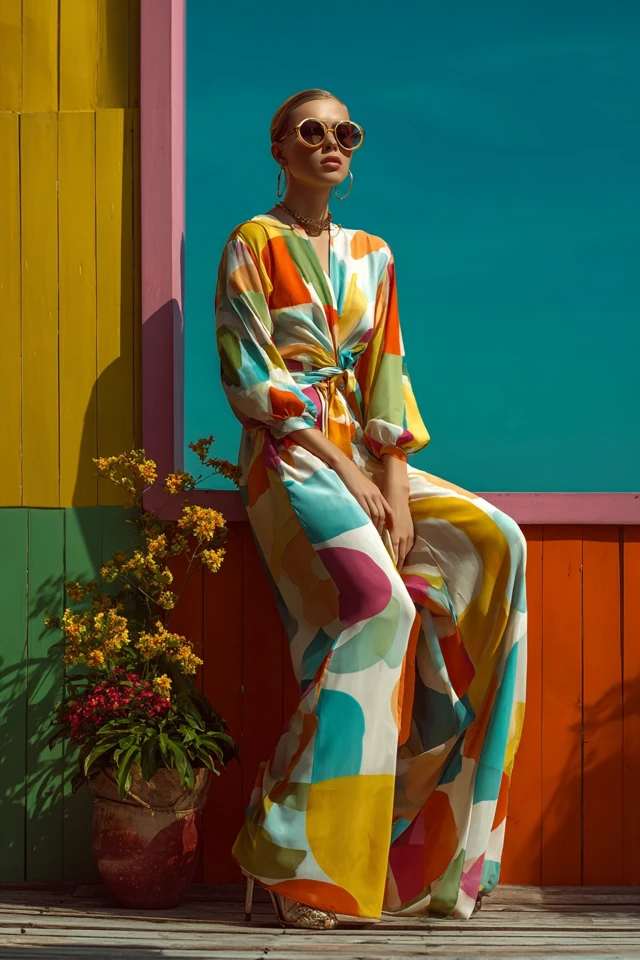
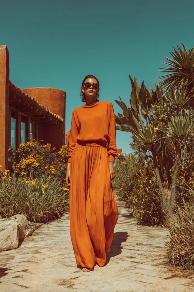
A bright beach color palette works when you limit it to two colors and give each a job. Coral with turquoise, or hot pink with white, are lively and photograph well in full sun. Let one color lead and use the other in a smaller piece, such as a bag or sandals.
Brights look strongest against neutral surroundings like sand, so skip busy prints in the same outfit.
Tips for choosing and wearing a palette
- Start with one anchor color you already own and build two supporting shades around it.
- Hold the fabric against your face in daylight. If the color makes your skin look tired, move it lower, as trousers or a skirt, and put a flattering shade near your face.
- For family photos, choose a shared palette of two or three related shades rather than identical outfits. Mixing solids with one soft pattern keeps it relaxed.
- Check the fabric as well as the color. Light linen and cotton breathe in heat, and a few resort touches, like a silk scarf or loafers, tie into a light academia earth-tone palette.
Colors and sun protection
Color is the fun part, but fabric does the protecting. The Skin Cancer Foundation notes that a UPF of 30 to 49 offers very good protection, while UPF 50+ offers excellent protection. Dermatologist Anna L. Chien, MD, says in the same piece: "A hat with a 3-inch brim protects the top of your scalp, ears and face." A wide-brimmed straw hat also happens to suit every palette above.
If you want more outfit ideas in this soft, bookish mood, see light academia resort layers and a minimalist light academia capsule.
Frequently asked questions
Which color goes with beach color?
Warm white, cream and tan go with almost any beach shade. Blues pair well with white or sand, and soft yellow works with cream or light blue.
What are some popular beachy colors?
Sandy beige, ocean blue, navy, white, sea green, aqua and pale yellow are the most common. Coral and turquoise are the usual choices for brighter looks.
What colors look best on the beach?
Soft, slightly muted shades such as cream, light blue, sage and butter yellow look relaxed against sand and water. Bright colors also work if you limit them to one or two pieces.
Filed under Outfit Ideas