Beach Color Combinations: Palettes That Look Best
- Words by
- Julio Arco
- Published
- Reading
- 4 min
The easiest beach color combinations are built from three things you can see at the shore: sand, water and sky. Pair a warm neutral with one blue and one soft accent, and the outfit looks like it belongs there.
Below are the palettes that work best for beach color combinations in clothes, from calm neutrals to brighter pairings, and how to choose between them.
Sandy neutrals and warm whites
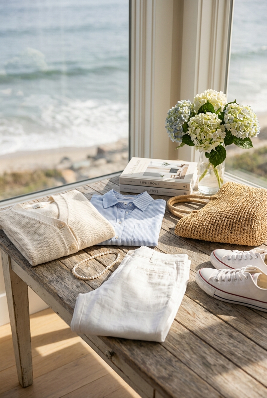
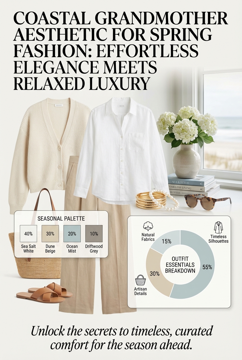
A neutral coastal color palette is the safest place to start. Oatmeal, ecru, stone and warm white sit close together in tone, so they blend instead of competing. Against sun-warmed skin they usually look softer than stark white.
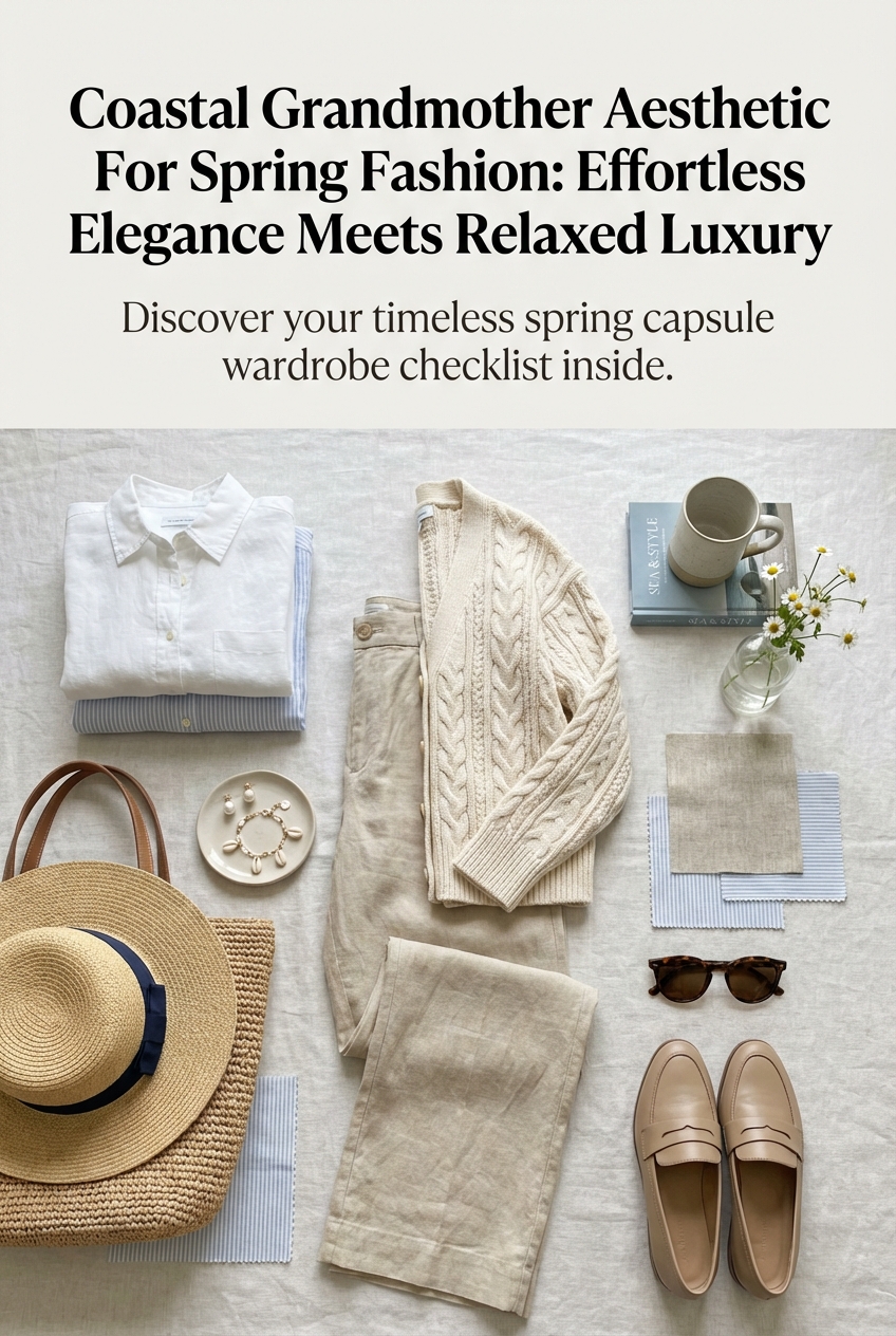
The risk is looking flat when everything is the same beige. Mix two or three whites in one outfit, say a cream sweater over bright white trousers, and the small contrast gives the look depth. Through the lens of evidence-based design, I'd also vary texture here: a linen shirt next to a knit reads as two different colors even when the dye is nearly identical, because the surface changes how light reaches your eye.
For fabric ideas that suit this palette, see the coastal spring fabric guide.
Ocean blues and nautical palettes
Blue is the most popular of the beachy colors because it echoes the water. Chambray, sky blue and washed denim work almost as neutrals, so they pair with sand, white and khaki without effort.
Navy and white
This is the classic. Navy gives the strongest contrast, white keeps it fresh. A striped shirt over white shorts or a navy dress with white sandals is nearly impossible to get wrong. If navy feels heavy in strong sun, swap it for a mid-blue.
Tonal blues
Wear light blue with deeper blue and one neutral. Keeping blues within one family looks calm and deliberate, as long as the shades are clearly different from each other.

Soft yellows and sun-kissed accents
Butter yellow and pale lemon add warmth without shouting. They look best next to white, sand or chambray blue. Use them in one piece, such as a top, a scarf or a bag, rather than head to toe.
Yellow and blue together is a safe pairing because the two sit opposite each other on the color wheel and balance one another.
Blues and greens for a seaside feel
Sage and seafoam green sit between sea and dune grass. Pair them with cream or sand and a touch of blue. A sage linen shirt with ecru trousers is a quiet palette that photographs well and does not date quickly.
Bright and playful beach pairings
If you want a bright beach color palette, keep it to two colors and let a neutral do the rest. Coral with turquoise, or sunny yellow with aqua, feels lively when white or sand sits in between.
- Choose one bright piece and keep the other items neutral.
- Avoid mixing more than two saturated colors in one outfit.
- Let bags, hats and sandals carry the brights if you prefer a calmer dress or top.
What colors look best on the beach?
Light, slightly muted colors tend to look best because they sit comfortably against bright sand and water. Very dark colors can look heavy, and neon can look harsh in strong light. Within that range, pick the shade that flatters your skin: warm creams for golden undertones, cooler whites and blues for pink undertones, though you should trust the mirror over any rule.
Color and sun protection
Color is a style choice, but fabric matters for sun. The Skin Cancer Foundation notes that a UPF of 30 to 49 offers very good protection, while UPF 50+ offers excellent protection. For a hat, dermatologist Anna L. Chien, MD, says, "A hat with a 3-inch brim protects the top of your scalp, ears and face." A neutral wide-brim hat fits every palette above. For personal sun-safety questions, check with a dermatologist.
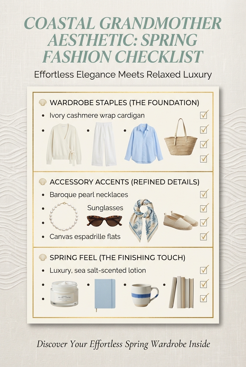
How to choose and use a palette
- Start with one base neutral: sand, white or stone.
- Add one main color, usually a blue or green.
- Finish with a single accent in yellow, coral or a deeper blue.
- Check texture: at least two different surfaces, like linen and knit, keep a soft palette from looking flat.
For a dress, let the print or color be the star and keep sandals, bag and hat in neutrals. For evening by the water, lightweight fabrics in these same palettes work well, and a sheer cover-up adds a layer without adding another color. If wind is likely, a relaxed windbreaker in sand or navy fits right in.
Frequently asked questions
Which color goes with beach color?
Warm white, sand and chambray blue go with almost every beach shade. Add one soft accent like butter yellow or sage if you want more interest.
What are some popular beachy colors?
Sand, ecru, white, sky and navy blue, seafoam, sage green and butter yellow are the most common. Coral and aqua are the usual bright picks.
What colors look best on the beach?
Light, slightly muted blues, creams and soft greens sit well against sand and water. Pick the shade that flatters your skin.
What is a good beach color palette for family photos?
Choose two or three related colors, such as white, light blue and sand, and let everyone wear a different mix. Avoid logos and busy prints so the group looks cohesive.
Filed under Seasonal Trends