Spring Color Palette: Find Your Type and Best Colors
- Words by
- Julio Arco
- Published
- Reading
- 6 min
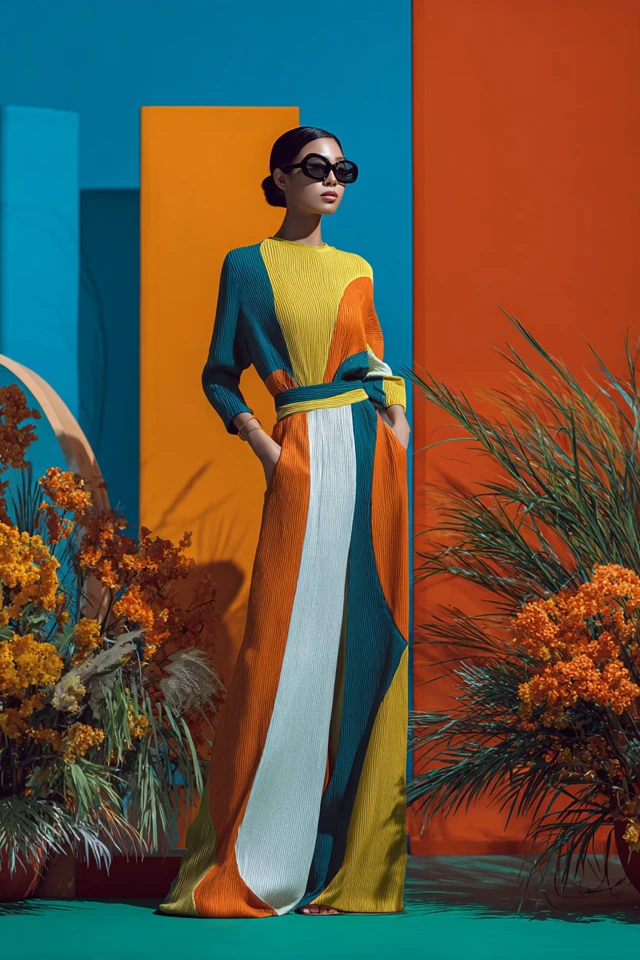
A spring color palette is built from warm, clear, fresh colors: coral, peach, warm pink, leaf green, turquoise and creamy neutrals. If your skin has a golden or peachy cast, your eyes and hair look lively in bright warm shades, and heavy dark or dusty colors make you look tired, you are probably a spring.
Below you will find how to check, how the three spring subtypes differ, which neutrals and pinks work (including the hot pink that Barbiecore made popular), and whether to wear gold or silver.
How to tell if you are a spring
If you are asking yourself which spring color palette am I, start with the basics. Seasonal color analysis sorts people by undertone (warm or cool), plus how light or deep and how soft or clear their coloring is. Springs sit on the warm, clear and fairly light side.
Try this in daylight, near a window, with no makeup and your hair pulled back:
- Hold a peach or coral top under your chin, then a cool berry or icy pink one. If peach makes your skin look even and healthy while the berry looks harsh, that points to spring.
- Look at your veins in your wrist. Greenish veins often lean warm, but lighting and skin tone can fool you, so treat it as one clue.
- Compare gold and silver jewelry. Gold that looks natural against your skin is another warm sign.
- Notice how you react to black or charcoal near your face. If shadows appear under your eyes, your coloring is probably too bright and warm for it.
None of these is a verdict alone. Phone cameras, wall colors and the shirt you wore yesterday all shift what you see, so look at the overall pattern. If you land between two seasons, that is common and usually means a blended palette rather than a mistake.
Through the lens of evidence-based design, I'd judge each color by how it reads next to your skin, not by how it looks on the hanger. A color can be lovely on its own and still flatten you, because the eye reads the contrast between fabric and face first.
The three spring subtypes
Most spring guides split the season into light, warm and bright. Your subtype decides which direction to push the palette.
Light spring color palette
Light springs have delicate, fairly low-contrast coloring. Think buttery yellow, peach, soft aqua, light warm pink and ivory. Dark or very saturated colors can overpower you, so keep the strongest shade away from your face or wear it in a small amount.
Warm spring color palette
A warm spring (often called true spring) leans golden through and through. Camel, golden tan, warm coral, tomato red, grass green and turquoise all sit well. Pure icy colors and grayed pastels tend to look flat.
Bright spring color palette
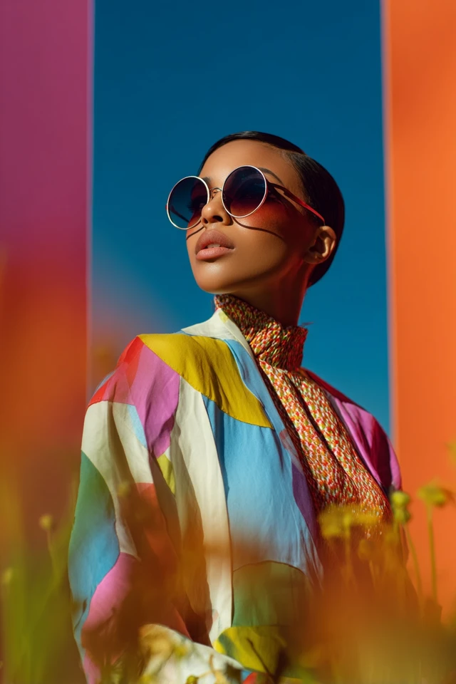
Bright springs have more contrast between skin, hair and eyes, and they can carry saturation. Clear hot pink, vivid coral, emerald, bright turquoise and crisp white work well. Muted, dusty shades are the ones that dull you.
| Subtype | Main trait | Colors to reach for | Go easy on |
|---|---|---|---|
| Light | Delicate, soft contrast | Peach, light aqua, butter yellow | Black, deep burgundy |
| Warm | Golden, rich warmth | Camel, coral, grass green | Icy pastels, cool gray |
| Bright | Clear, higher contrast | Hot pink, emerald, turquoise | Dusty, muted tones |
What colors look best on spring skin tones?
The best colors for spring skin tones share three qualities: warmth, clarity and a light-to-medium depth. That covers a wide range of skin, from fair and peachy to golden tan and warm deep brown, because undertone matters more than how light or dark you are.
- Pinks: warm pinks like salmon, watermelon and a clear bubblegum or hot pink with a hint of orange rather than blue.
- Reds and oranges: coral, poppy, tomato and apricot.
- Yellows and greens: buttercup, golden yellow, apple green, leaf and spring green.
- Blues: turquoise, aqua, warm periwinkle and a bright mid-blue instead of navy.
This is also why a hot pink Barbiecore piece can work for a bright spring but fight a cool summer. The shade of pink matters as much as the idea of pink.
Neutral spring color palette
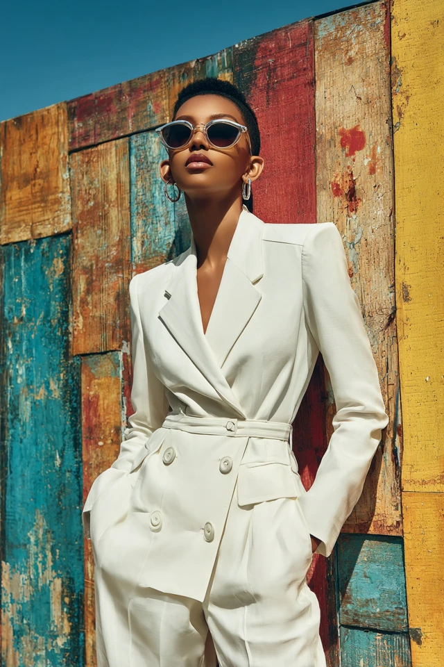
Springs do best with warm neutrals instead of stark or cool ones. Reach for ivory and cream in place of optic white, camel and warm tan in place of gray, and soft chocolate or warm navy in place of black.
A simple formula: a camel blazer, a cream tee and light-wash denim as the base, then one clear color on top, like a coral knit or a hot pink bag. Warm brown shoes and a cream tote keep everything in the same temperature range.
Can a spring wear black?
Yes, with some care. Black is high contrast and cool, so it can look heavy against warm, light coloring. Wear it away from your face, such as trousers, a skirt or shoes, and put a clear color near your neckline. If you love black on top, add a warm scarf, gold jewelry or a bright collar to soften the edge. Warm espresso brown or deep warm navy usually gives the same grounding effect with less drama.
Should springs wear gold or silver?
Gold is the easier default: yellow gold, rose gold and warm brass echo a spring's undertone. Silver can work if it is bright and polished, particularly for a bright spring, but heavily oxidized or cool gunmetal tones tend to look severe. Mixing metals is fine when one dominates, and you can bridge them with a piece that contains both.
Color combinations and prints
Springs look best in combinations that keep their clarity. A few that work:
- Hot pink with cream and camel for a softer Barbiecore take.
- Coral with turquoise for a high-energy pairing.
- Peach with warm white and light denim for an easy daytime look.
- Leaf green with golden yellow for a fresh, garden feel.
For prints, choose clear, medium-scale florals, gingham in warm tones and cheerful stripes over tiny muted patterns, which can blur together. Texture helps too: a matte cotton and a satin in the same coral do not read identically, because the surface changes how light reaches the eye. As an architect trained in evidence-based design, I'd put the shinier fabric near the face only if you want that color to be the focus.

Building a spring wardrobe from your palette
Start with the pieces you wear most and swap in colors that suit you. A pink blazer, a cream trench or a pleated skirt in a warm shade each work across several outfits. Choose breathable fabrics like cotton, linen blends and light knits for the season.
Wash bright pieces inside out in cold water and follow the care label to help colors stay clear. For more ideas, see the spring capsule wardrobe essentials or the It Girl spring color palette.
Sister palettes and nearby seasons
If spring does not quite fit, the neighboring palettes are the likeliest match. Autumn shares the warmth but is deeper and softer, so think olive and terracotta (see the earth tones wardrobe edit). Winter shares the clarity but is cool, which is why icy and jewel tones suit it better. If you enjoy saturated warm reds, the tomato girl edit is a good place to test them.

For a pink-forward look beyond spring, the Barbiecore resort capsule shows how the same warm pinks travel.
Frequently asked questions
How do I tell if I am a spring color palette?
Compare warm shades like peach and coral against cool ones like berry near your face in daylight. If the warm, clear colors make your skin look even and the cool or dusty ones look harsh, you likely lean spring.
Should Springs wear gold or silver?
Gold is usually the easier match because it echoes a spring's warm undertone. Bright, polished silver can work for bright springs, especially in small pieces.
What colors look best on spring skin tones?
Warm, clear colors such as coral, peach, warm pink, turquoise and leaf green. Warm neutrals like camel and cream make a good base.
Can a spring wear black?
Yes, but keep it away from your face or soften it with a warm scarf or gold jewelry. Warm espresso brown or deep warm navy can be gentler alternatives.
Filed under Outfit Ideas